Pentagramがコロナ禍におけるポジ
ティブなデータを反映したインフォ
グラフィック「Happy Data」を公開

当たり前と思っていた日常を一変させてしまった新型コロナウイルスの感染。この世界的危機と言える状況下では、多くの情報が行き交い、あっという間に現在が過去になっていくような変化の激しい日々が続いています。

“過去を見つめることから未来をつくり出す”ことを実践してきたクリエイティブユニットSPREADは、コロナ禍において行動を起こしたクリエイティブな活動をリサーチし、未来を考えるヒントを探ります。本ウェブでは、SPREADが特に注目するものを毎日1本ずつ紹介していきます。

この投稿をInstagramで見る

Today’s #HappyData, the first in a series by @giorgialupi and team looking for hopeful data in the pandemic, focuses on healthcare workers on the frontlines of the fight against Covid-19. . As Covid-19 overwhelmed hospitals and medical staff in New York, healthcare professionals across the country answered the call in March and traveled to help fight the pandemic. . Data source: “76,000 Healthcare Workers Have Volunteered to Help NY Hospitals Fight Coronavirus” @forbes . #HappyData is a new initiative from Giorgia and team to spotlight uplifting and hopeful statistics, and visualize them through their home windows to begin to picture a new reality post-pandemic. . You can explore more data, and submit your own, at www.happy-data.co (link in bio). . #happydata #datavisualization #datavisualisation #dataviz #data #datahumanism #healthcare #covidart #covid19 #covid #stayathome

Pentagram(@pentagramdesign)がシェアした投稿 –

今日のトピック

Pentagramが、パンデミック中に確認されたポジティブなデータを収集し、反映したインフォグラフィック「Happy Data」を制作しました。公式インスタグラム特設HPで公開しています。

SPREADはこう見る

「Happy Data」は、コロナウイルスによる世界的な景気後退と、Black Lives Matterの抗議活動をきっかけにPentagramが自発的に始めたプロジェクトです。このプロジェクトで見られるインフォグラフィックは、最新の感染者数のようにすぐに役立つ情報ではありません。しかし、惨禍の中にあるポジティブな情報を視覚化することで、落ち込んでいる人の励みにしたいとの思いから制作されました。

「Happy Data」のアイデアは、Pentagramのスタッフが自宅待機で孤独に過ごすなか、窓から外を見ながら将来のことを考えていた最中に思いついたそうです。グラフィックは、手書きの文字やイラスト、グラフ、制作チームとその友人が撮影したスナップ写真で構成されており、親しみやすい印象です。現在コロナ関連7件、Black Lives Matter関連が6件、計13件制作されています。

公式HPの最新の更新では、COVID-19に対応するワクチンの開発状況が取り上げられています。世界中で166種類以上のワクチンが開発されており、少なくとも5つのワクチンが実用化目前の状態、ひとつは効果を承認されている段階まできているようです。ワクチンの数を示すドットは、タンパク質を元にしているものなど種類ごとに5色に配色されています。

この投稿をInstagramで見る

In this #HappyData, @giorgialupi and team look at the outpouring of donations to bail funds in support of #BlackLivesMatter. . Over the past weeks, organizations across the country have seen unprecedented levels of donations in support of peaceful protesters and the Black Lives Matter movement. . Data sources: “Racial Justice Groups Flooded With Millions in Donations in Wake of Floyd Death” @nytimes, “On Social Media, Donation Matching Raises Millions for George Floyd Protesters” @nbcla, @gofundme . Giorgia and team originally started their #HappyData project several weeks ago to share uplifting data with the world about the fight against Covid-19. But because of the tragic murders of George Floyd, Breonna Taylor, Ahmaud Arbery and Rayshard Brooks, as well as instances of police brutality against Black people across the country, they felt it was right to pause the #HappyData project and take time to fully reflect on this moment, educate themselves and continue to use the platform to support and amplify the good work of others, in the Black Lives Matter movement and beyond. You can explore more data, and submit your own, at www.happy-data.co

Pentagram(@pentagramdesign)がシェアした投稿 –

Black Lives Matterに関するデータでは、ひとつの足跡が100万ドルを表し、抗議運動に対して前例のないほど高額の寄付金が寄せられていることを取り上げています。投稿された6月30日当時、ブルックリンに住む人々からの寄付金は180万ドル、クラウドファウンディングサイト「Go Found Me」には250万ドルが集まり、ジョージ・フロイド氏が亡くなった場所であるミネソタ州からは、若い女性とトランスジェンダーをサポートするグループ、Women for Political Changeや、逮捕され裁判を待つ人々に保釈金を提供する活動をしているMinnesota Freedom Fund(ミネソタ活動基金)などから3000万ドルが寄せられているようです。合計3430万ドル、日本円にして約36億2000万円です。

「Happy Data」を見ていると、制作者が意図した通り気分が前向きになります。どんなに辛い状況にあっても発想の転換でポジティブな思考に切り替えることができると感じました。手法はインフォグラフィックの一種ではありますが、情報を整理し、わかりやすく伝えるだけでなく、まるでInstagramのストーリーや誰かの日記を見ているような感覚になります。PCで制作したデータというより、誰かがペンで書き込んだような印象で、新鮮な表現方法になっているのではないでしょうか。

この投稿をInstagramで見る

Today’s #HappyData, from the series by @giorgialupi and team looking for hopeful data in the pandemic, focuses on decreasing air pollution. . One silver lining of mandatory stay-at-home orders: air pollution levels are trending downward. In Italy, both NO2 and PM2.5 (atmospheric particulate matter) are down significantly since the beginning of the year. . Data source: “An Analysis of the Impact of the Coronavirus Lockdown on Our Environment” @towardsdatascience . #HappyData is a new initiative by Giorgia and team that seeks out uplifting statistics and visualizes them through home windows to begin to picture a new reality post pandemic. Thanks to Sara Confalonieri for her view of a blue sky day in Porta Venezia, Milan. . You can explore more data, and submit your own, at www.happy-data.co (link in bio). . #happydata #datavisualization #dataviz #data #datahumanism #covidart #covid19 #covid #italy #milan

Pentagram(@pentagramdesign)がシェアした投稿 –

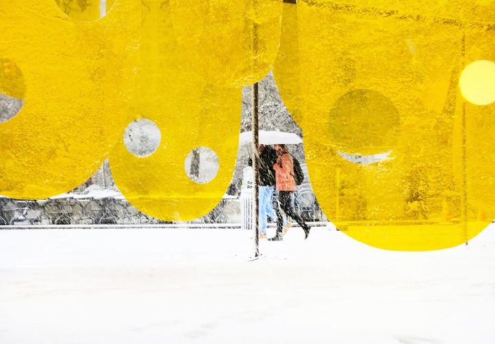
5月28日に投稿された大気汚染レベルの低下を表現したインフォグラフィックでは、ミラノの街中で撮影された青空にNO2とPM2.5(大気中の粒子状物質)の減少経過が書き込まれています。オレンジと水色のドットが、まるで普段目に見えない空気中の粒子を視覚化しているようです。

各グラフィックの情報量が適切なのかもしれません。毎回テーマはひとつですが、身近な風景の写真と手書きの文字によって、日常で実際に起きているできごとなのだとすんなり受け入れられる効果を感じました。想像の余地がある点が、コロナ禍で先が読めない状況にマッチしているのかもしれませんね。End

Pentagram
ロンドン、ニューヨーク、ベルリンなど世界中に拠点を置くデザインスタジオ。グラフィックやアイデンティティ、製品・パッケージング、展示計画、Weおよびデジタル体験、広告、コミュニケーション、サウンドおよびモーションなどその領域は多岐にわたる。

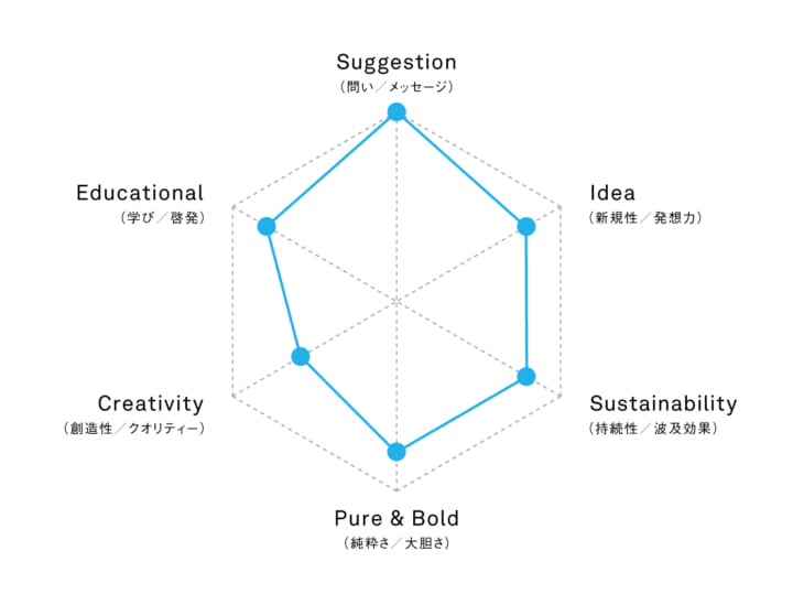
▲本プロジェクトをレーダーチャードで示しました。6つの属性のうち、成果物のデザイン性を「Creativity」で評価しています。「Pure & Bold」は目的に対して一途な強さを感じるか、やりきっているかという、SPREADが自らの仕事において大切にしている視点です。