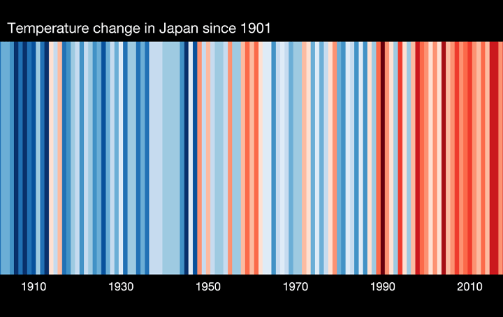
 ▲1901~2019年の日本の温暖化ストライプ
地球が温暖化していることは誰もが知っていることだが、たとえば数十年間で平均気温が1度上昇したと言われても、なかなかイメージしにくいのではないだろうか。
そこで、英レディング大学の気候科学者 Ed Hawkinsは、世界中の国々の気温上昇をカラーバーで表示できる「Show Your Stripes」というサイトを公開している。
Warming stripe cloth face masks now available. #showyourstripes
(5% royalties will support the NHS)https://t.co/Sihpx0Yp63
— Ed Hawkins (@ed_hawkins) May 11, 2020
地域と国を選択すれば、およそ100~150年ほどの範囲で、各国の平均気温がどのように上昇したかがわかるようになっている。このサイトでは説明がされていないが、青が濃いほど平均気温より低い、赤が濃いほど高いということになるのだろう。
Awesome. Hoping for a sample…! https://t.co/dhY2uoNHzf
— Ed Hawkins (@ed_hawkins) April 21, 2020
Great idea! https://t.co/ljJd0pUuqw
— Ed Hawkins (@ed_hawkins) April 13, 2020
実はこうした縞模様のグラフは、画像としてダウンロードが可能。HawkinsのTwitter上では、この画像をデザインに使ったさまざまなアイテムが紹介されている。路面電車や建物の外装、クレジットカード、さらにはドリンクの缶やマスクまで登場。
Thankyou @SenatorCarper, @RepLowenthal and the other US lawmakers who are wearing the ‘warming stripes’ to start conversations about climate change at the #StateOfTheUnion tonight! pic.twitter.com/tL9sUw2Uof
— Ed Hawkins (@ed_hawkins) February 4, 2020
As @KHayhoe says, the most important thing we can do about climate change is talk about it. pic.twitter.com/dvWuXGP4jR
— Ed Hawkins (@ed_hawkins) February 9, 2020
Did anyone see the amazing Warming Stripes light sculpture in Berlin? Designed by @huebueno. pic.twitter.com/56xf5ALl7l
— Ed Hawkins (@ed_hawkins) January 22, 2020
「Show Your Stripes」のサイトで気になる地域をチェックしてみよう。そして、HawkinsのTwitterでも画像がどんなふうに使われているか探してみよう。![]()

「AXIS」編集部
Webマガジン「AXIS」の編集チーム。デザイン専門メディアらしい情報から、日々の業務で溢れ出しそうなことまで、メンバーの有り余るエネルギーをもってお伝えします。